Hammerhead
Responsive website & mobile app (2014)
I was selected as the sole User Experience Designer in the inaugural R/GA “Connected Devices” Accelerator, powered by Techstars. This Accelerator backed ten startups building products combining hardware, data and digital services. Hammerhead, one of the startups, was building a bike navigation GPS to help cyclists discover amazing, safe, bike routes anywhere in the world.
I helped Hammerhead with:
- User experience design for the mobile app
- Front and backend development for a responsive website
Mobile App UX
I created wireframes for Hammerhead’s mobile app. The app enables people to search destinations and sync the routing instructions to the physical Hammerhead device which sits on the handlebars of their bike.
Below is a sample of my work.
Opening app animation

First time app experience

Mapping interactions

Responsive Website
After the working on the UX of the mobile app, Hammerhead asked me to build version 2 of their website to launch in time for SXSW 2014. The goal of the site is primarily to generate revenue by taking pre-orders of the Hammerhead deivce.
I worked alongside three visual designers on this project and helped to translate desktop designs for all screen sizes while doing all of the frontend and backend development for the website.
View the live website.
Original visual designs by Sojin Ouh, Chia-Fang Wu and Ray Sison

Little big details
A quick overview of some of the small things I obssessed over when making this website.
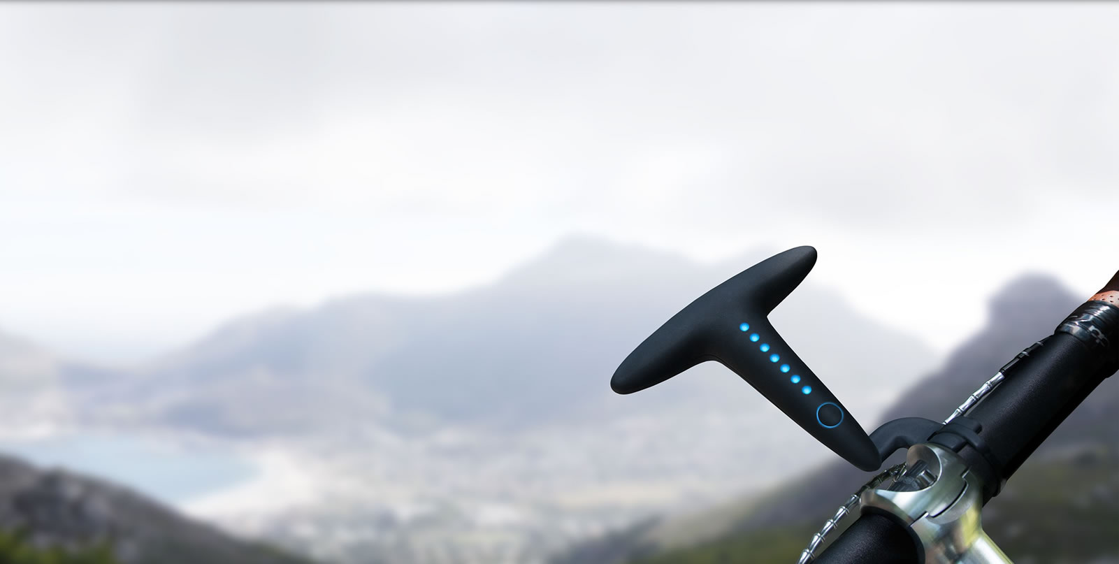
LED animations
The LED animations which show the lights on the Hammerhead device took a lot of time and effort. This is a really important interaction on the site because it demonstrates for the first time, how Hammerhead works. As the user approaches this section, the lights dim as the background smoothly transitions to black, removing all distractions and letting the product shine. The first LED animation of the device is triggered as the Hammerhead enters the screen to ensure that most people will get a perfectly timed first sequence.
Originally, the LED animation was an autoplay video but it made the site unnessesarily large. I also made cinemagraph style animated GIFs from the video but unfortunately, as I found out, Safari in iOS struggles sometimes with GIFs and creates random stutters within the animation sequence. This might be acceptable for the odd animated cat video, but it was unacceptable for our product demonstration.
This meant that I ended up making the LED animation sequence using SVG and CSS, with static image fallbacks for browsers that don’t support SVG. This took a lot more time to create but it also had the benefit of keeping this interaction lightweight and resolution independent, and importantly, beautiful on iPhones.
Make a left turn
Hammerhead One effortlessly guides you through your route with intuitive light signals.
Wrong way, go back
Go explore! If you get lost, Hammerhead One will show you the best way to get back on track.
Lights on
Hammerhead One is visible in all weather conditions. Let’s make sure you are, too!
Performance
Performance is an incredibly important aspect of a systems user experience. Here are a couple of optimizations I made to the site:
- The site is built mobile first and loads small images by default. Larger images are served for larger screens using media queries and Picturefill
- All bitmap images were optimized using Image Optim
- The animations for the LED lighting effects were done with SVG and CSS after it proved much lighter than videos or animated GIFs
- SVG is used for vector based images with fallbacks
- The CSS and javascript was concatenated and minified using Grunt.js
- The files are compressed server side using gzip and cached locally (via the .htaccess file)
- The images that don’t require alpha transparency, were converted to progressive jpgs
- Note that before placing this site on the CMS, there were much less HTTP requests and a lower overall page size.
Progressive enhancement
Our aim was to create a functional site for everyone regardless of device before enhancing the experience for people with more capable browsers. For example, to make this site functional for users without javascript, several tweaks needed to be made, like changing the URL on the “Pre-Order” button to go directly to the Shopify site instead of to the javascript reliant Shopify lightbox.
Content management
I placed this site on Perch CMS to enable Hammerhead’s content team to easily maintain the site. I chose Perch because it is relatively lightweight and produces clean semantic markup.
Awards (2015)
- Cannes Product Design Lion: Gold, Active Sportswear & Sports Equipment
- Cannes Cyber Lion: Gold, User Experience
- Cannes Cyber Lion: Silver, Tangible Tech
- Cannes Cyber Lion: Bronze, Innovative Use of Technology
- Cannes Mobile Lion: Gold, Visual Design / Aesthetic
- Cannes Mobile Lion: Silver, User Experience
- Cannes Mobile Lion: Bronze, Utility
- D&AD Yellow Pencil: Product Design / Interactive Design for Products
- D&AD Yellow Pencil: Digital Design / Connected Products
- D&AD Wood Pencil: Mobile Marketing / Innovative Use of Mobile Technology
- D&AD Yellow Pencil: Digital Design / UX, Interface & Navigation for Websites & Digital
- CLIO Sports Awards: Silver, Digital / Social – Apps
- The One Show: Silver, Intellectual Property – Integrated Digital & Physical Products